

High-Quality Custom Printed Tape: What Good Printing Looks Like
High-quality custom printed tape should do more than look attractive in an online proof. The finished print needs to remain sharp, consistent and readable across every repeat, while the tape itself still performs properly on the carton.
For UK businesses comparing branded packaging tape, print quality is best judged through several practical checks: edge definition, colour registration, ink coverage, repeat consistency, base-material suitability and the accuracy of the approved proof.
Quick answer: good custom tape printing has clean edges, consistent colour, accurate registration and an even repeat that remains readable at the finished 50 mm tape width.
What does high-quality custom tape printing look like?
Sharp logo edges without obvious feathering, filling-in or broken fine detail.
Consistent positioning when two or three print colours are used.
Even ink coverage across the full production run.
A repeat distance that keeps the brand visible without making the design feel crowded.
Readable text and recognisable artwork at the actual tape width.
A finished result that reflects the approved artwork proof and chosen tape base.
1. Sharp edges and readable detail
The quickest quality check is to examine the edges of the logo and lettering. Curves should look controlled, straight lines should remain straight and small counters inside letters should stay open. If fine details merge together at the proof stage, they are unlikely to improve once printed.
Packing tape is a narrow, repeating format rather than a large advertising panel. A simplified logo often looks more professional than a highly detailed design reduced too far. This is especially important for small straplines, web addresses and thin outlined type.
2. Accurate colour registration
Registration describes how accurately separate print colours align. On a two- or three-colour design, poor registration can create unwanted gaps, overlaps or coloured shadows around the artwork. Strong registration keeps the design intentional and helps small elements remain legible.
Registration is easiest to judge where colours meet. Look at fine borders, reversed-out text and narrow gaps between shapes. A sensible design also allows for the realities of printing on a flexible packaging material instead of relying on extremely delicate alignment.
3. Consistent colour and ink coverage
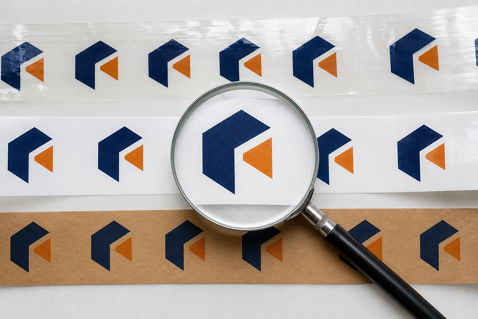
Good print should look consistent from repeat to repeat. Large solid areas should not appear unexpectedly patchy, while fine elements should not fill in. Higher ink coverage and flood-coated designs place greater demands on colour consistency, so the production proof and print specification matter.
Brand-colour references are useful, but the final appearance can change with the tape base, ink opacity and surrounding carton colour. Provide a clear Pantone or other recognised colour reference where available, then confirm what the printing process can reproduce on the selected material.
4. The tape material changes the final appearance
The same artwork can look different on clear film, white film and kraft paper. White provides a neutral background, clear tape allows the carton colour to influence the design, and kraft creates a natural background that usually rewards strong contrast.
ViTape's Custom Printed PP Tape is supplied at 50 mm × 66 m and is a cost-effective general packaging option. Clear or white bases give businesses different ways to present the same artwork.
The Custom Printed PET Tape is also 50 mm × 66 m and is designed for a strong, durable branded finish. Material choice should reflect the parcel, storage and handling conditions as well as appearance.
For a paper-based presentation, ViTape's Custom Printed ECO Tape is supplied at 50 mm × 50 m. The paper surface gives artwork a different character from film tape and works particularly well with clear, high-contrast designs.
5. Repeat spacing and print direction
A sharp logo can still perform poorly if the repeat is wrong. The design should appear frequently enough to be visible across different box sizes, but not so often that the tape looks busy. The direction also matters: artwork should read correctly when the tape is pulled from the dispenser and applied across the box seam.
Check the proof at actual size. Confirm the logo width, the blank space between repeats and whether the design needs to be readable from one direction or both. These decisions affect the finished parcel more than a zoomed-in screen preview suggests.
6. Start with print-ready artwork
Even a capable printing process cannot restore detail that is missing from the supplied logo. Vector AI, EPS or PDF artwork normally gives the cleanest starting point because it can be resized without pixelation and makes colour separation easier.
If you are preparing a logo for the first time, read ViTape's Personalised Tape With Logo: Artwork & Design Guide. It covers vector files, contrast, repeat spacing and the practical limitations of a 50 mm print area.
Send the original vector logo whenever possible.
Avoid screenshots or images copied from social media and websites.
Remove unnecessary fine lines and very small text.
State the required print colours clearly.
Confirm whether the design will print on clear, white or brown tape.
Keep an approved version of the artwork for accurate repeat orders.
What to check before approving the artwork proof
The artwork proof is the final opportunity to catch avoidable problems before production. Review it at the finished dimensions rather than judging only a large image on screen.
Confirm the correct logo version, spelling, contact details and web address.
Check the tape material, width, base colour and print colours.
Review the logo size and repeat spacing at actual scale.
Inspect small lettering, reversed-out elements and thin lines.
Confirm the print direction and how the repeat will sit on a sealed carton.
Ask questions before approving anything that is unclear.
Print quality is only part of tape quality
A visually perfect print is not useful if the tape is unsuitable for the box. Carton weight, recycled content, surface dust, storage temperature, humidity and the way the tape is applied can all affect sealing performance.
Where the application is demanding, test the proposed tape on representative cartons. Apply it with the normal dispenser, leave it under realistic storage conditions and inspect the seal after the carton has been handled. The best custom tape combines a professional print with a specification suited to the job.
Common causes of disappointing printed tape
Low-resolution artwork supplied from a website or screenshot.
Text and fine detail reduced below a practical printed size.
Weak contrast between the ink colour and tape base.
A multi-colour design that depends on extremely fine registration.
An overcrowded repeat with too much information.
Approving a proof without checking actual dimensions.
Choosing a material for appearance alone without considering the carton and environment.
How ViTape helps businesses achieve a professional result
ViTape supplies custom printed PP, PET and ECO tape for UK businesses, with options for branded logos, messages and multi-colour designs. Customers can upload artwork, review the design and receive a free digital artwork proof before production begins.
Use the ViTape online tape designer to choose a tape, upload your logo, preview the repeat and see pricing. If you are unsure which material or artwork format to use, contact the ViTape team for specification help.
Frequently asked questions
Which file format gives the best print quality?
Vector artwork such as AI, EPS or vector PDF is normally preferred because it scales cleanly and supports colour separation. A high-resolution PNG may be workable for simpler designs, but the original vector file is the stronger starting point.
Can a PNG or JPG logo be printed on tape?
Potentially, provided the file contains enough detail at the finished size. Send the largest original file available rather than a screenshot. The artwork team can confirm whether it is suitable or needs to be recreated.
Can custom printed tape match an exact brand colour?
Provide a Pantone or other recognised colour reference and confirm the available process with the supplier. Tape base, ink opacity and material can influence how a colour appears, so review the proof and specification carefully.
Which tape produces the sharpest print?
There is no universal answer. PP, PET and paper have different surfaces and visual finishes. The best result comes from matching suitable artwork, ink contrast and print coverage to the chosen tape material.
Will I receive a proof before printing?
Yes. ViTape provides a digital artwork proof for approval before production. Check the material, colours, scale, repeat and spelling carefully, because production begins from the approved artwork.
Create custom printed tape with a clear, professional finish
Choose your preferred material and design custom packing tape online. Upload your logo for a preview and free artwork proof, or compare the PP, PET and ECO paper product options before ordering.